
The best comedy theater in Westside – M.I.’s Westside Comedy Theater requested an update of their logo and a promotional flyer.
Solutions and Execution
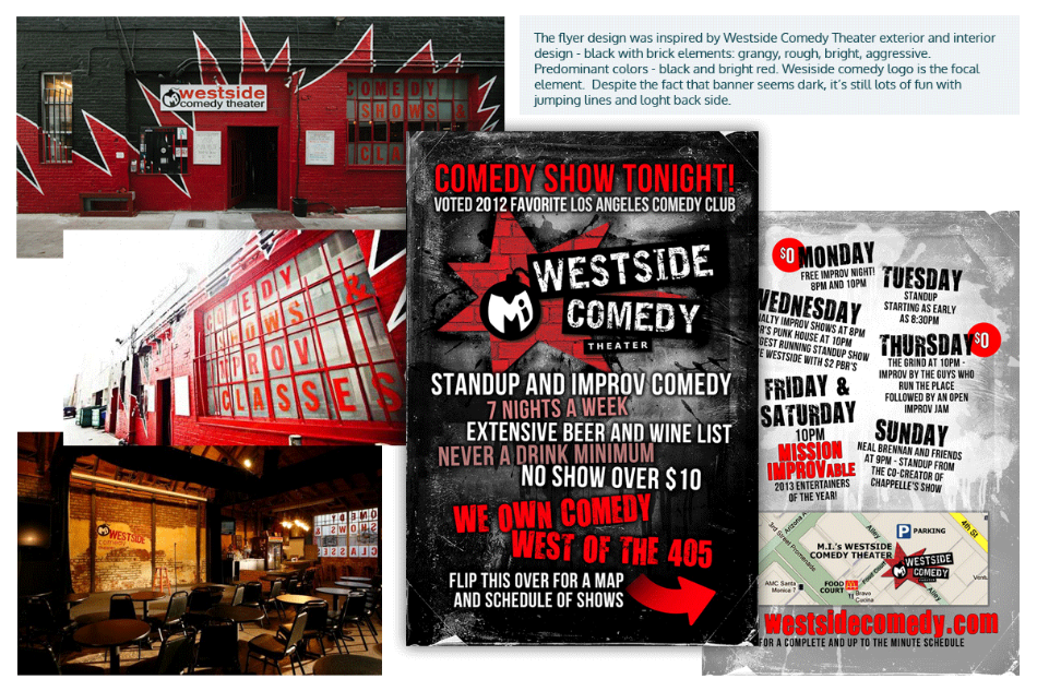
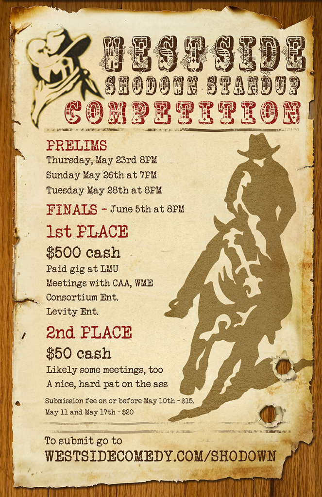
After the research it was determined that the best approach would be to ensure that the design resembled the rough alley theater design itself – dark with bright red brick elements.
Brand Logo – Brand Visual Message:
Westside Comedy Theater already had a logo with a bomb that was inspired by a drawing on the theater wall.
“We took the logo, polished it slightly, adding sleek fonts and maintaining the darker rough grungy mood of the logo
Marketing Design – Brand Visual Message:
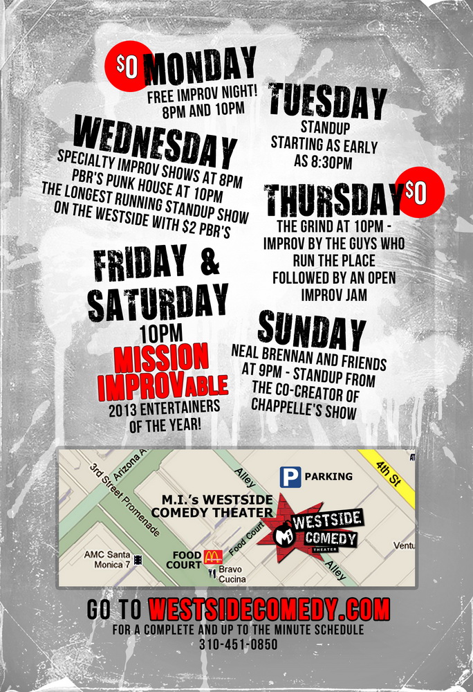
To keep consistency in the brand messaging, we maintained the grungy mood throughout the design of the main theater flyer – darker, scratchy, looking like a rough old wall.
Result
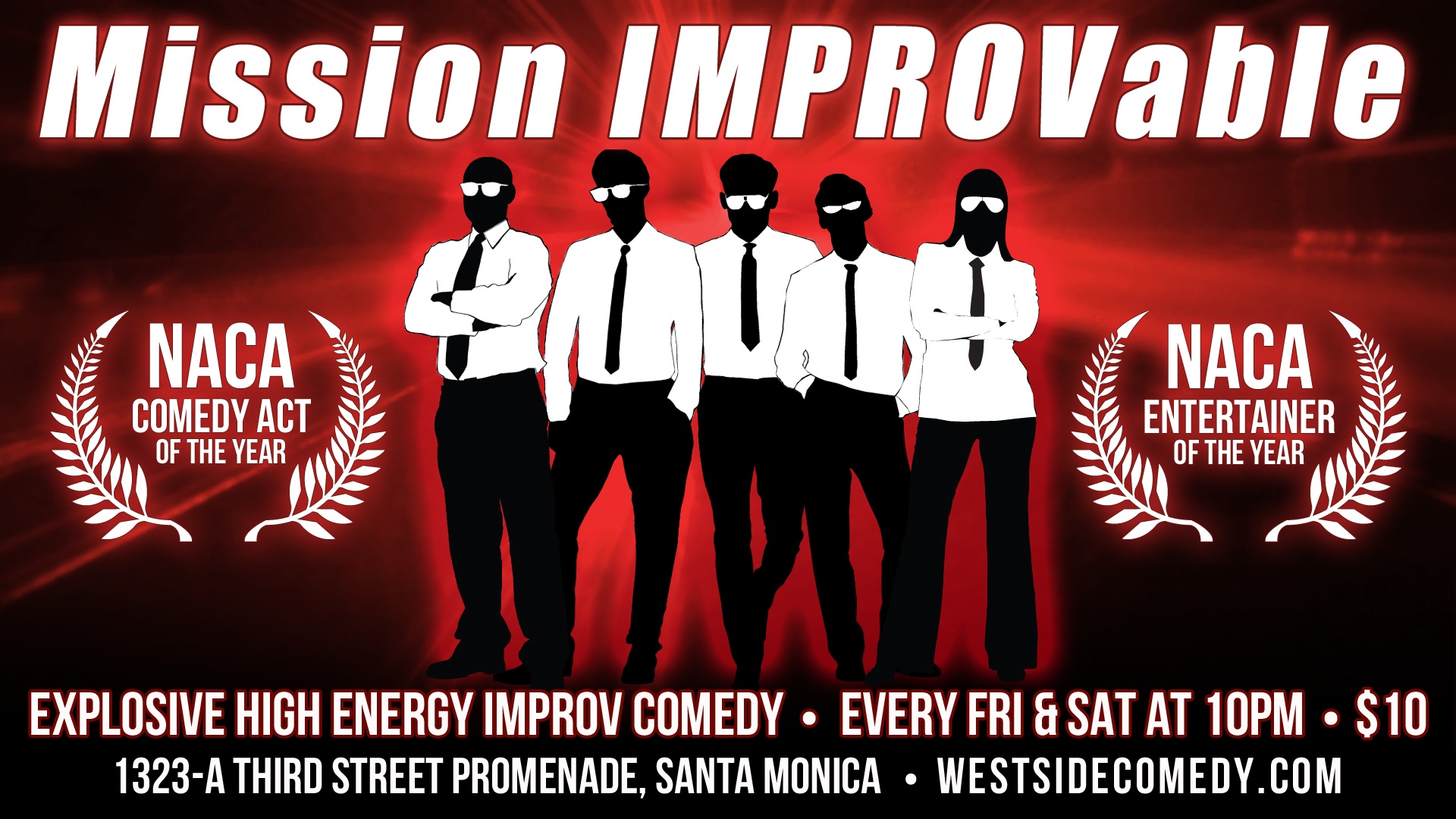
The Logo and the flyer design were and amazing success. Just by googling mi’s westside comedy theater you can see that the logo is still being used the same or very similar ways that it was designed back in 2011. The client used created design to produce other projects based on this graphics.
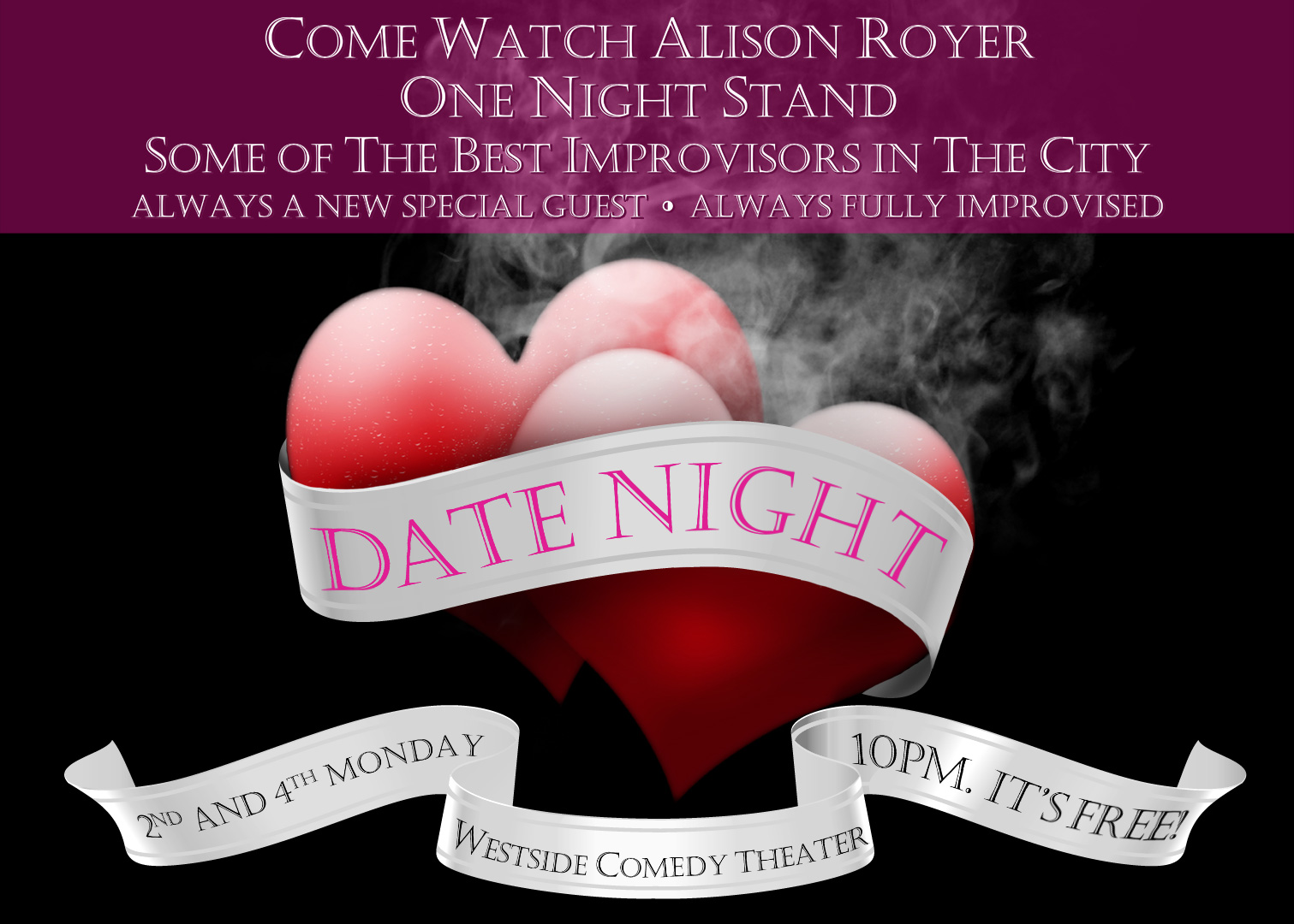
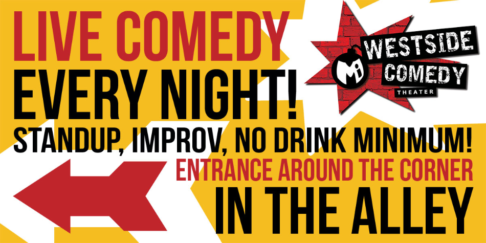
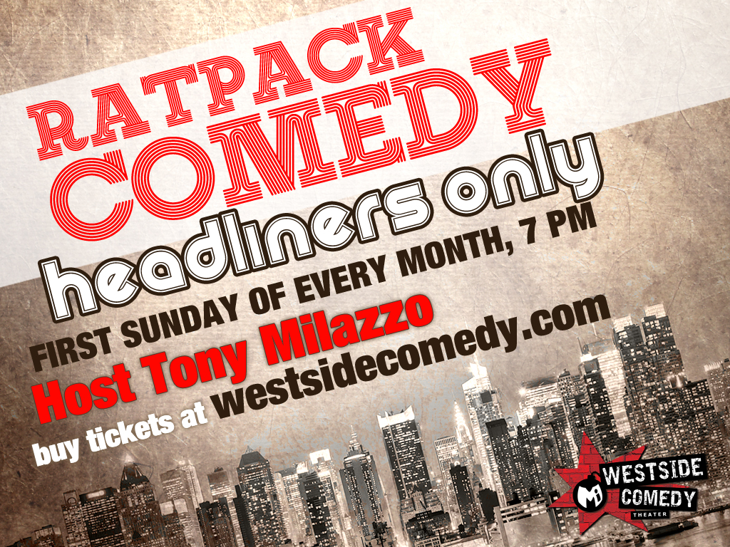
In addition to the flyer design I have done a few graphic projects for M.I.’s Westside Comedy Theater such as posters, flyers, banners. I also redesigned their logo.
Testimonial
Not only is Natasha incredibly talented, she has a great design aesthetic and is prompt and professional. She implements our feedback flawlessly and is a pleasure to work with. She has a great work ethic, she takes each individual job very seriously and always follows with everything we need. – Mike Betette, Westside Comedy Director
M.I.’s Westside Comedy Theater Gallery


Tasks, Methodologies, and Tools
- Branding
- Graphic Design for print
- Content editing
- Adobe Photoshop, Adobe Illustrator