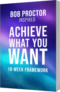
I love our new Manifestation guru Christie Marie Sheldon. She’s amazing, and I really like the idea of vibrational workouts. I really enjoyed her audios, even though it’s a little bit on a “too much of” irrational side when it comes to guides and talking to them, but that’s just me, I guess, may be someday I get in there too…
I liked her website, it’s pretty clean, however, I am not a big fan of endless landing pages (or sell pages) approach. I prefer to see a landing page of maximum 2-4 clicks, not 20! But for the sake of the content I was OK with its never-ending nature. I am sure that the site could be designed in much more elegant manner, it looks a bit too sale-sy to me, but, well, I guess this works for her, so let it be.
However when I subscribed to Christie’s emails, this where it started being nasty!
These days e-marketing is so competitive, so businesses really need to be on top of their game, and an email looking like this:

…can no longer attract customers or even keep them reading. It just has to be well-structured, with highlights, some images, graphic elements replacing text, and so on. Besides, I was really bummed about missing punctuation and even some very basic marketing mistakes, such as letting a reader know that the even is completely free in the very end of the letter, where big chunk of recipients never got to.
So, I have had enough, and decided to just go beyond “love or above” and design an email campaign for Christie Marie Sheldon. I have to admit, that created a design that would have been consistent with Christie’s website look. I didn’t want to overwhelm her or her support with something that doesn’t correspond with her current online representation.
This is what I believe this particular email campaign should be or do:
- There should be company/product logo!
- Message should be perceived as easy to read and actually be that!
- Main highlights should be visible at the first glance. If it’s an event registration, the button to the registration page should be visible right away. Needless to say, the fact that it’s FREE should be highlighted.
- Text should be visually structured. If it’s a list, it should be formatted as a list – with margins. If there are headers, they should be looking like headers.
- Call to action should be very well visible and alluring.
- There should be some imagery. However, I would stay away from using images just to use images. for instance, if it’s a registration, I would never use icons or elements resembling registration process such as computer screen, pen, online form… I used Christi’e photo, and I think that’s quite enough along with her signature at the end.
- It’s very good to have links back to the main sections of the site.
There are couple more things that Christie’s ideal email campaign could have, but let’s just see what her email could look like with all those ideas above implemented. Here’s what I created: