
Note: If this article feels dated to you, you’re not wrong—it is. It was written in 2005. But many of the underlying ideas remain relevant. Looking back, I suspect a few of them were even ahead of their time when this article was first published.
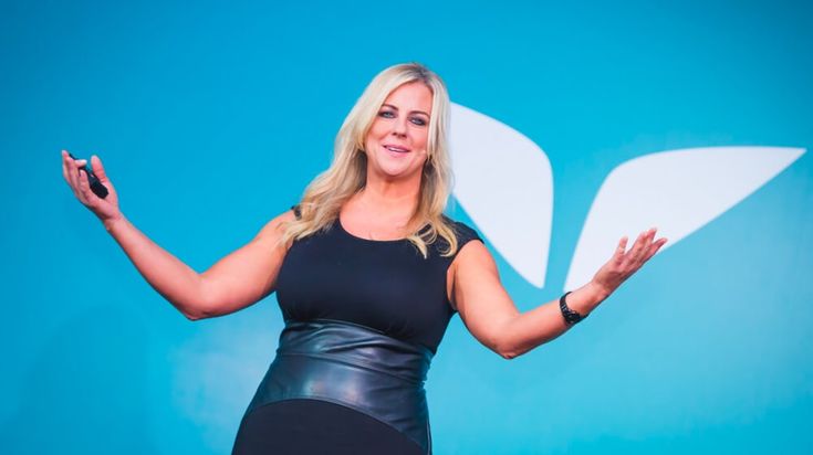
Christie Marie Sheldonis amazing. I liked her website, it’s pretty clean, however, I am not a big fan of the endless landing-page (or sales-page) approach. I prefer to see a landing page of maximum 2-4 scrolls, not 20! But the content was clear and easy to navigate and understand.
However, when I subscribed to Christie’s emails, this is where things became a little less impressive.
Email marketing has become one of the primary digital marketing channels. Businesses need to be on top of their game, and an email looking like this:

…may be enough to lose the reader altogether.
It has to be well-structured, with highlights, some images, graphic elements replacing text, and so on. Besides, I was really bummed about missing punctuation and even some very basic mistakes, such as putting important pitch details toward the bottom of the email, where many readers never get.
So, I decided to just go beyond “love or above” and design an email for Christie Marie Sheldon. I created a design consistent with the look and feel of Christie’s website.
This is what I believe this particular email campaign should be or do:
- There should be company/product logo that links back to the website’s landing page.
- Message should be easy to read
- Main highlights should be visible at first glance. If it’s an event registration, the button to the registration page should be visible right away. Needless to say, the fact that it’s FREE should be highlighted above the fold as well.
- Text should be visually structured. If it’s a list, it should be formatted as a list – with bullets, numbering, or proper indentation. If there are headers, they should be larger and/or bolder.
- Call to action should be very well visible and alluring, above the fold and repeated at the end of the email.
- Ideally there should be some imagery. In the example below, I am using Christie’s photo, and I think that is sufficient.
- It’s very good to have links back to the main sections of the site in the footer of the email.
- Each email may have legal information and absolutely must have an Unsubscribe link.
There are a couple more things that Christie’s ideal email campaign could have, but let’s see what her email might look like with these ideas implemented:

